Keen App Home Screen Redesign
Overview
Keen is the leader in psychic advice and dedicated to empowering lives by helping people discover answers to their most pressing questions. A network of psychic advisors serves a community of users by offering a diverse background of intuitive, spiritual services and so much more.
Objective
The Keen app was growing in revenue, but not profitability. We needed to find a more convenient way to get users to their most trusted advisor.
MY ROLE
Product Design, User Research
CASE STUDY
Keen App Home Screen Redesign
Discovery
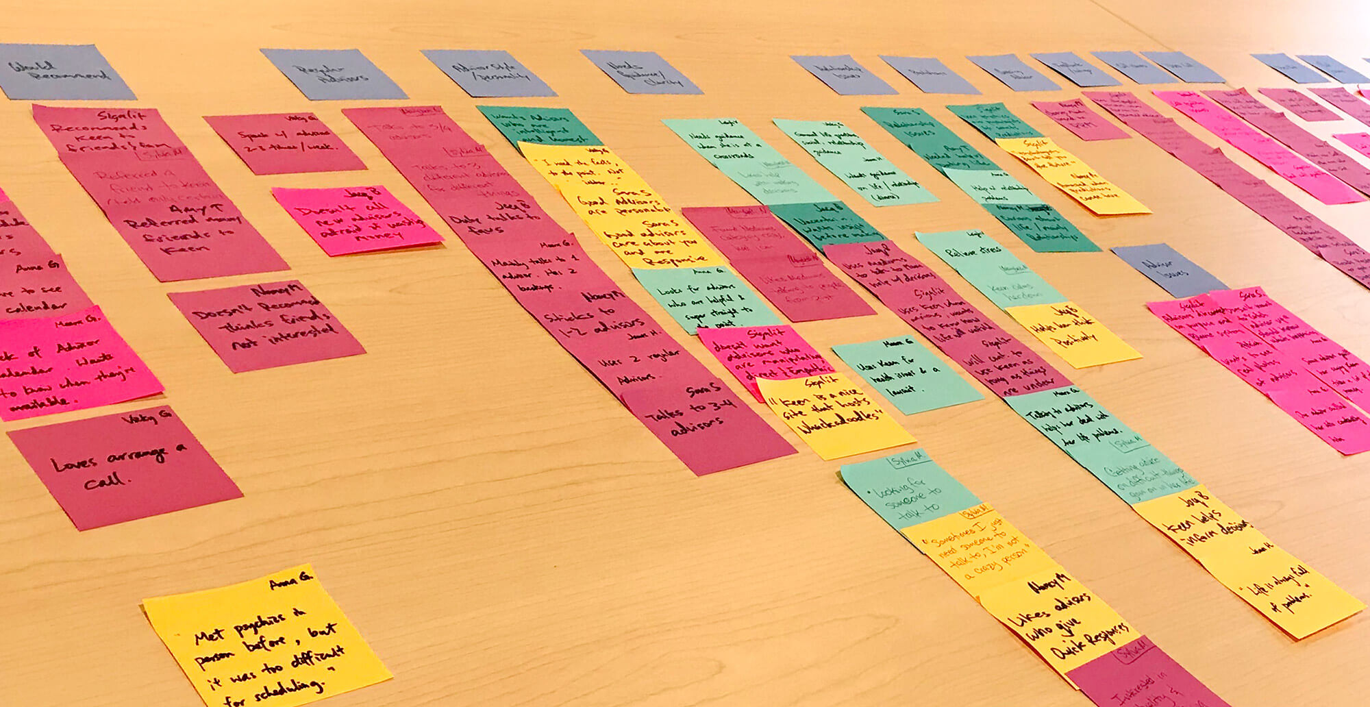
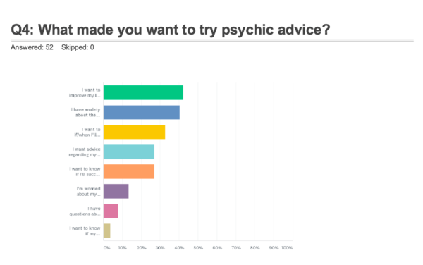
The first step was to find out who our user is. We knew a lot about our core user but needed to find out if that segment was also the core user of our app. So I ran a survey and aggregated the data using affinity mapping.
Insights
- App users skew younger with lower income than our core user.
- Users who transact tend to have love & relationship questions.
- Users who bounce are largely browsing.
- Chat is the most important feature.
- Horoscope and Best Match are more valued than we anticipated.
Problem Statement
As a user, I wish it was easier to connect with an advisor I trust to provide me long-term advice.
Hypothesis
We believe that if we improve the home screen experience, for both new and returning users, and we should be able to increase the retention and growth of users that prefer chat and convenience.
Research
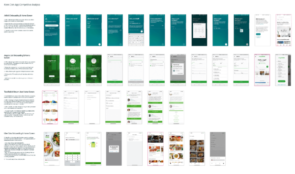
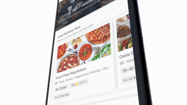
I did some competitive analysis to find out how other apps and services are solving the same problem. I analyzed other marketplace apps such as AirBnB, Angie’s List, Uber Eats, and TaskRabbit.
What I found was tiled layout of listing cards was a common and a clean way to present the advisor listings. Different sets of lists were being used to serve personalized content to users. And lists were filtered and organized according to the current phase of the customer journey that the user was in.
Ideation
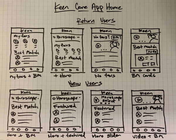
After understanding the problem and researching common solutions, I sketched some rough ideas of possible solutions. I sketch out two flows to account for the personalization of new user vs return.
I tried different layouts of listings to explore how we could display them to the user. I also contemplated a hero slider vs just showing listings or horoscopes feature. I did a design review of my sketches with the Product Manager to make sure we are on the same page. Then iterated on them until we find a solution we both like.
Lo-Fi Design
Now I start to take my ideas and create wireframes. Here I get a real sense of the screen space I have to fit our solutions in. And begin to think about what we want to be shown above the fold, and the items we are willing to let the user scroll to get to.
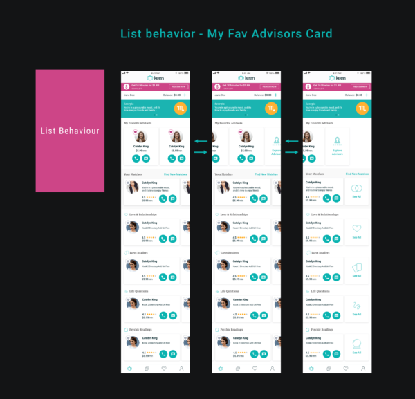
I iterate on the designs as I make some decisions such as what height certain modules should be. How the user should interact with the lists. How to layout and display buttons. And I start thinking about microinteractions such as how the lists should behave when a user interacts with them. I iterate based on these decisions until the PM and I are happy with the designs.
Usability Testing
Now time for some clickable prototypes using Sketch, Invision, and its plugin Craft. The prototypes are used to test and validate the viability of our solutions with real users.
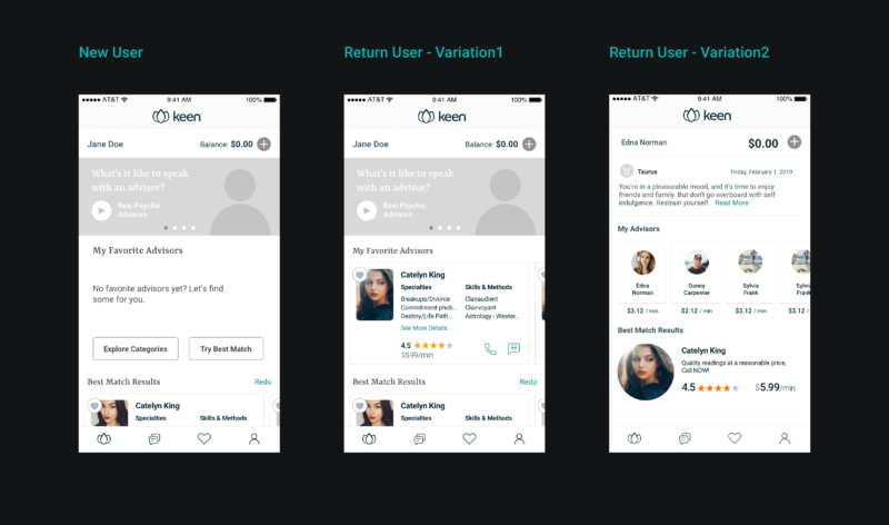
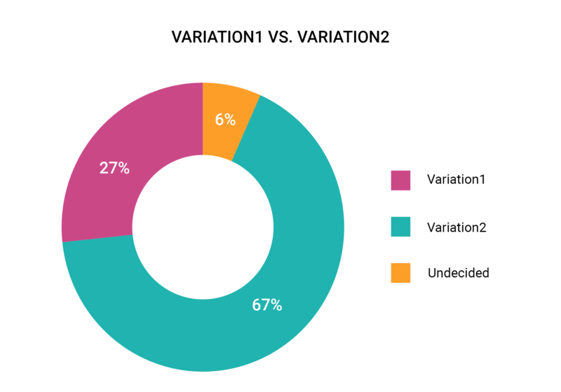
What I found from testing was users preferred less clutter and were jarred by the amount of actions that Variation 1 had. They preferred Variation 2 with bigger tiles and the carousel hero because it felt “warmer” to them and less “salesy”. Also as hypothesized earlier in the process, there was a clear distinction between what new users wanted to see and what return users expected.
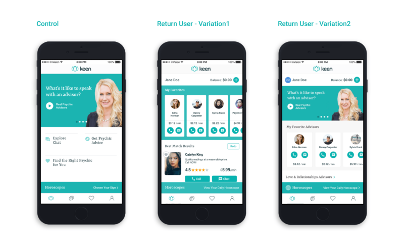
Hi-Fi Design
What we concluded is that our MVP needed to be a progressively changing UI with a personalized based on the where the user was in the customer journey.
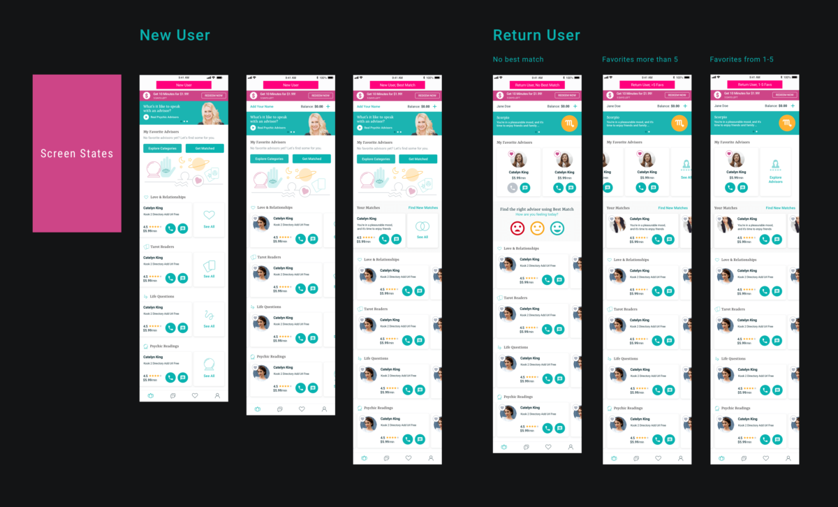
We decided to show them little to no listings above the fold first, depending on screen size. Mainly the slideshow with introduction video and primary call-to-actions would be shown. Until they searched for and favorited advisors. At which point we would replace the primary CTA area with their favorites. And after their first transaction, we would remove the intro video from the slide show. Thus return users would see an interface with populated listings, creating a more personalized experience.
The finishing touches were added to the UI, and the interaction designs for all the edge cases were mapped out and sent to engineering along with all the assets.
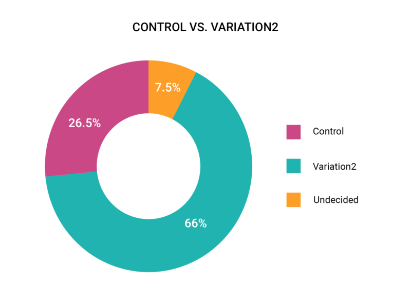
Outcomes
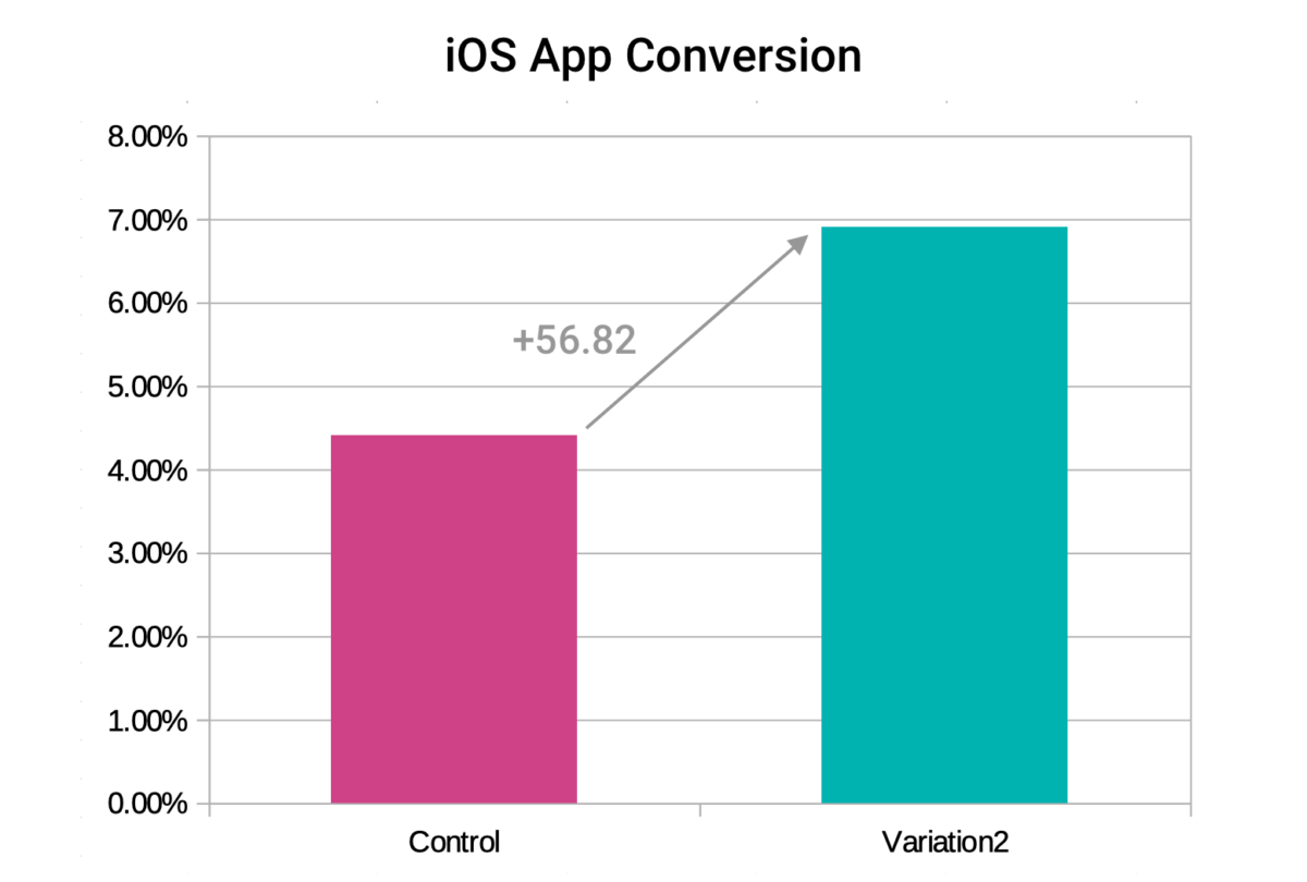
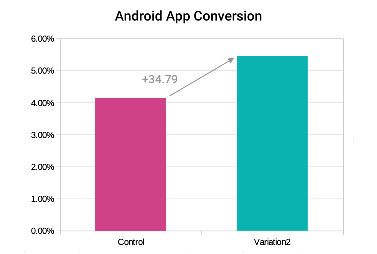
After a 50% roll out of the winning variation the funnel metrics showed a significant increase in conversion over the control. 57% lift for the iOS app and a 35% lift in conversion for the Android app.
Let’s Work Together
I’m available for freelance work and I’d love to hear about your project. Send me your info below or contact me here.